In my last post I wrote about using collage in your journals. For this post, I thought I would walk you through my process of actually using the collage method on a journal cover. This is a journal I did last year and one of my favorites visually.
In the beginning…
I started with a word. Saudade. I forget how exactly I came across this word. I suppose I was feeling a bit nostalgic and melancholic at the time and Googled for a bit. Saudade doesn’t have a direct English translation but it does encompass those two feelings. I’ve read it being described as “a feeling of longing for something that may or may not exist.” I liked the idea of using this emotional state as the theme for my journal and decided to find a way to incorporate it into the design.
In my research of the word I discovered a place; Rua das Saudade in Margão, Goa, India. Goa had been under Portuguese colonial rule for over 400 years until 1961.
A suburb of Margão, Goa’s largest city, has a street named Rua de Saudades. It was aptly named because that very street has the Christian cemetery, the Hindu shmashana (cremation ground) and the Muslim qabrastan (cemetery). Most people living in the city of Margão who pass by this street would agree that the name of the street could not be any other, as they often think fond memories of a friend, loved one, or relative whose remains went past that road.
-Wikipedia entry
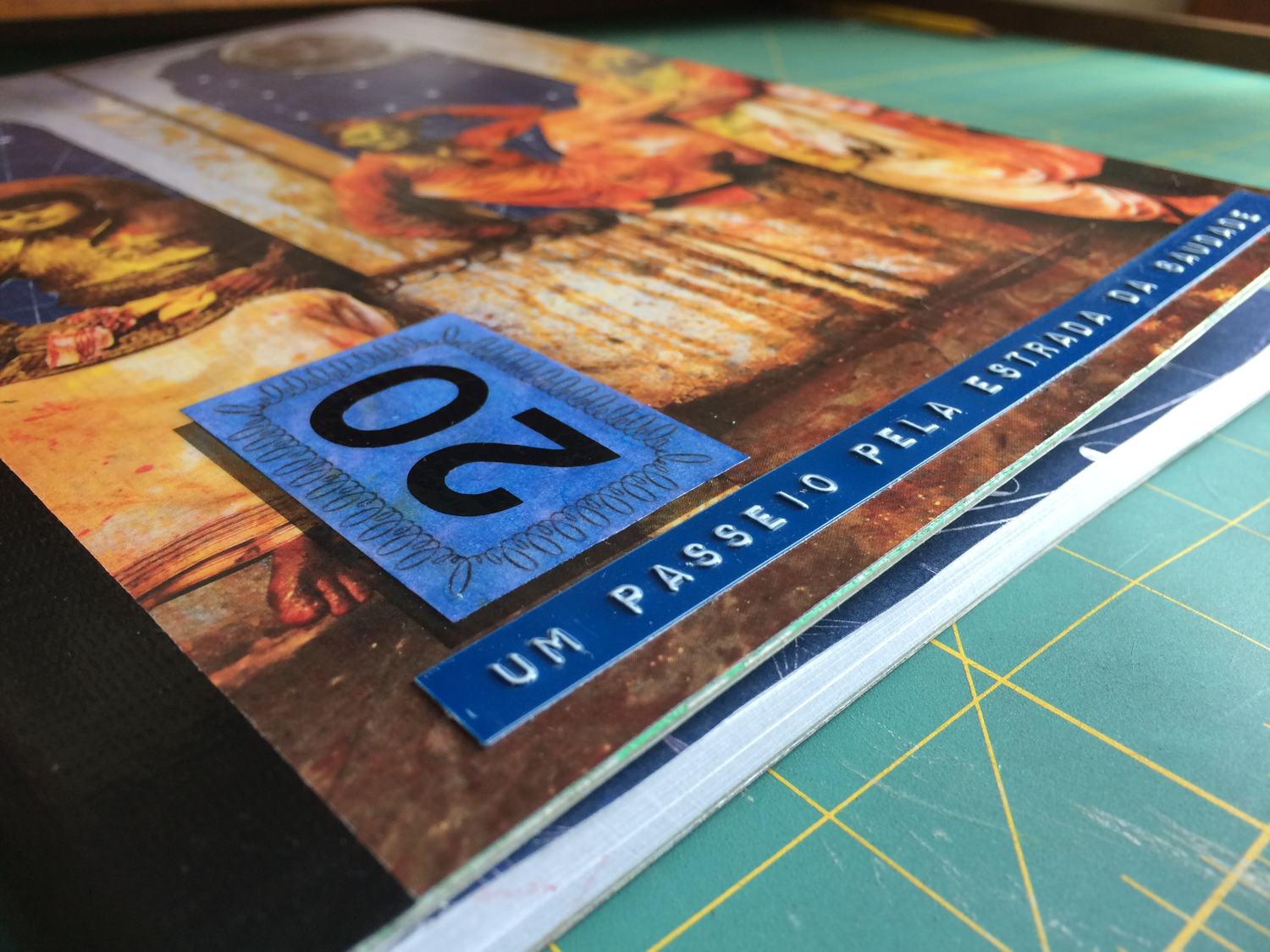
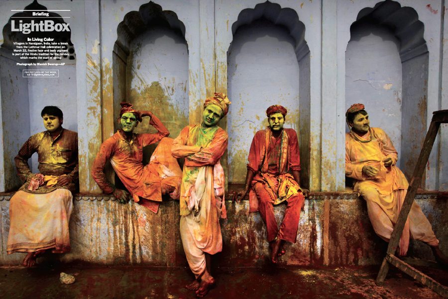
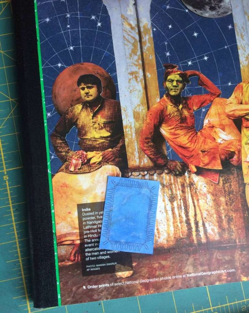
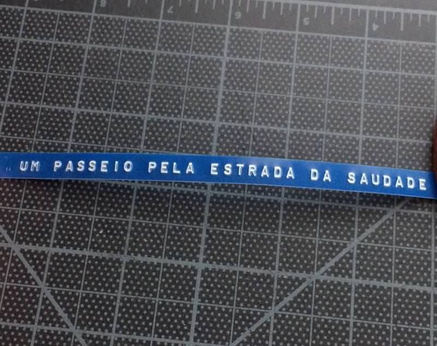
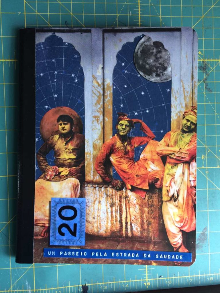
I had a friend, fluent in Portuguese, translate the title I had in mind… “Um Passeio Pela Estrada Da Saudade” which means “A walk down the street of melancholic longing for something that may or may not exist.” This mental image of walking down this street in India reminded me that I had a great magazine spread that I had clipped out for collage use. It is of several men at rest during the Lathar Holi, one of the color festivals in India.
So now I had this great imagery, title, and theme to work with. Time to get to work.
The build
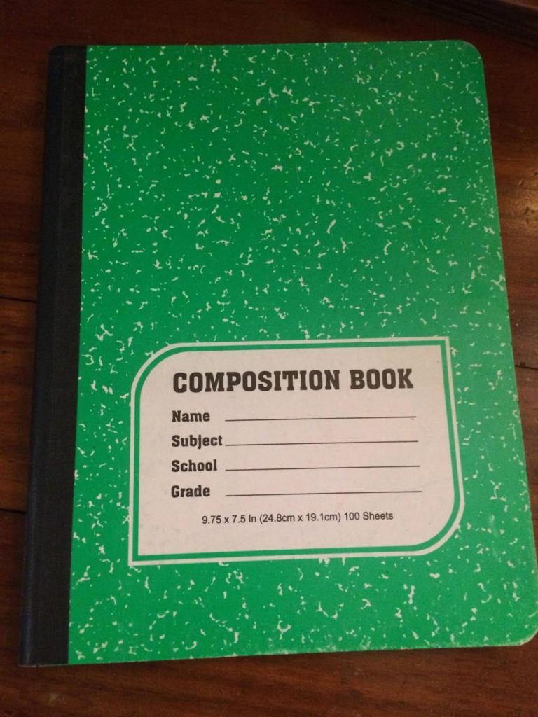
First, I needed a notebook. Just a plain old composition notebook for this journal. Almost all of my journals are made with composition notebooks. I love them since they’re so cheap to buy and easily customized.
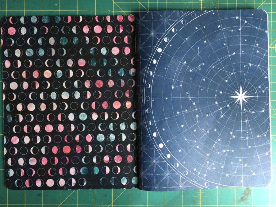
Beginning the collage for the cover starts with the layout of collage items. Star charts are from JoAnn’s, the main image from the spread, moons and planets from various magazines. The main image was a two page spread so I was able to change the placement of the people to suit my cover. This is the basic layout I had in mind. Note that I have already cut out the alcoves backgrounds where the men sit.
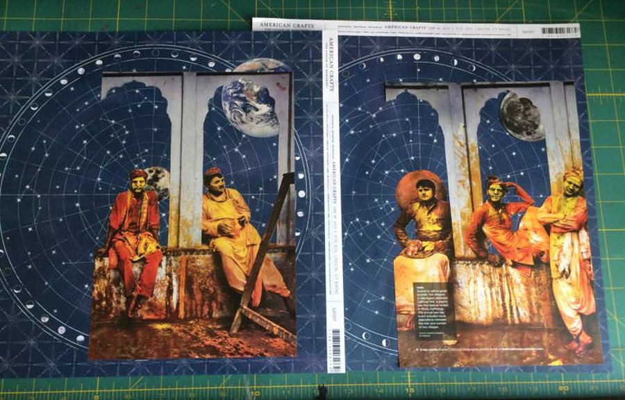
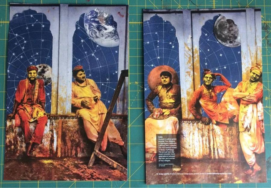
Here it is all glued together and cut to cover size. I used the star chart as the base to which I placed the moons and planets where I wanted them using a glue stick. Overlaid on top is the main image. I used 3M Super 77 spray adhesive to glue that.
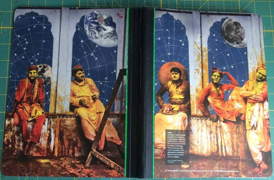
I then used 3M Super 77 spray adhesive to attach the collages to the covers of the composition notebook. After attaching, I trimmed the excess and gave it two good coats of clear acrylic spray. This is a very important step in order for the collage to stay flat and not wrinkle once I do the Mod Podge coat. The acrylic seals the collage. If you think you need more than two coats then go for it. The same goes for the Mod Podge. I did two coats at this point.
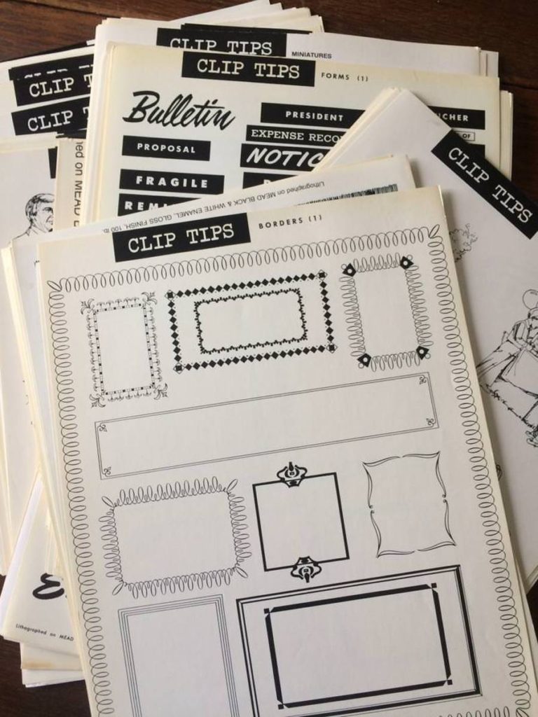
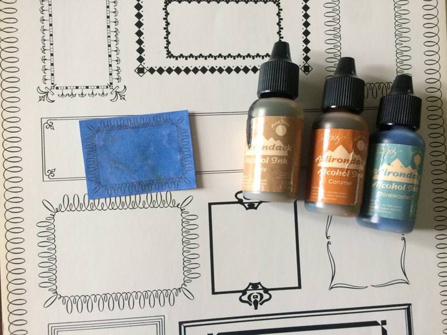
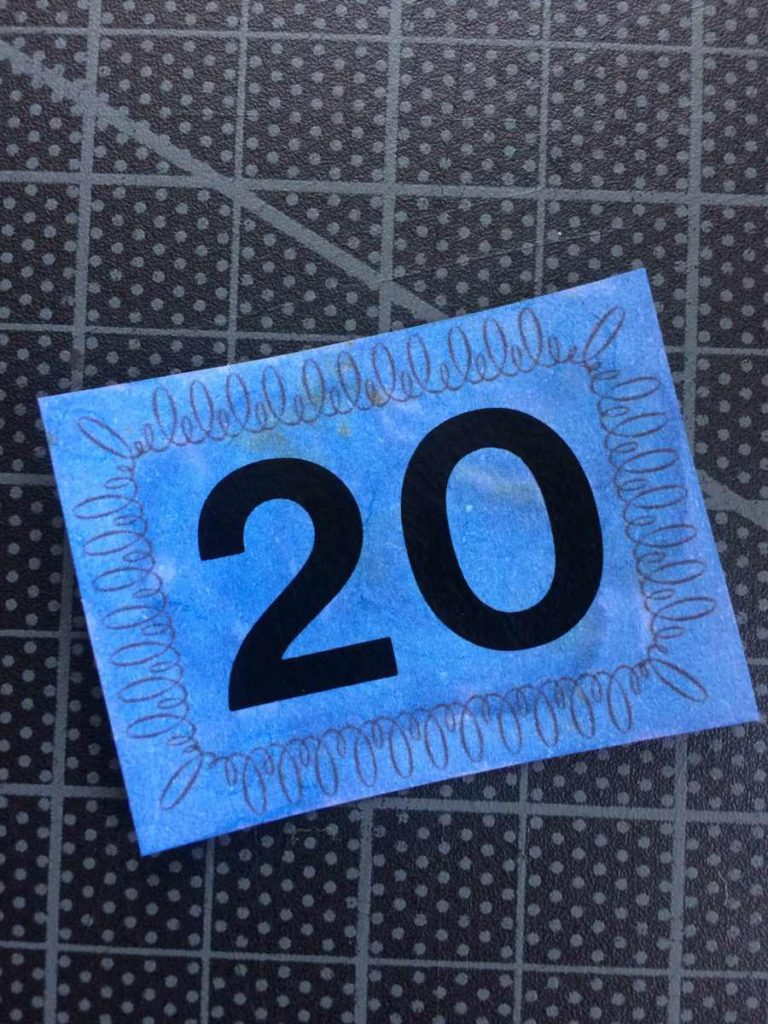
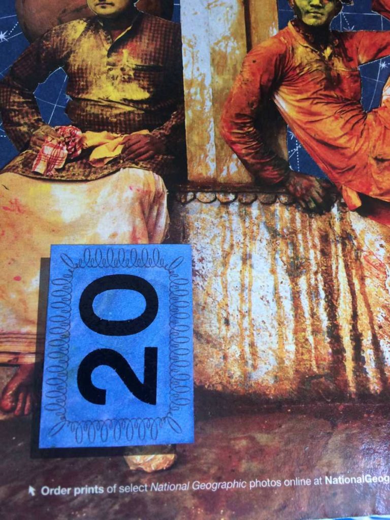
I needed something to cover up the text block on the front cover. I found a huge stack of vintage clipart at my local thrift store for a couple bucks. Going to use the border shown middle left here. I scanned the border and resized it with an image editor. I used alcohol inks to color it. Mostly blue but some hints of the brown.
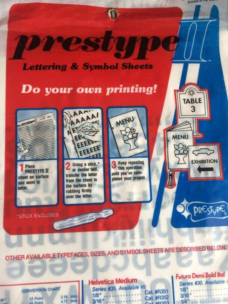
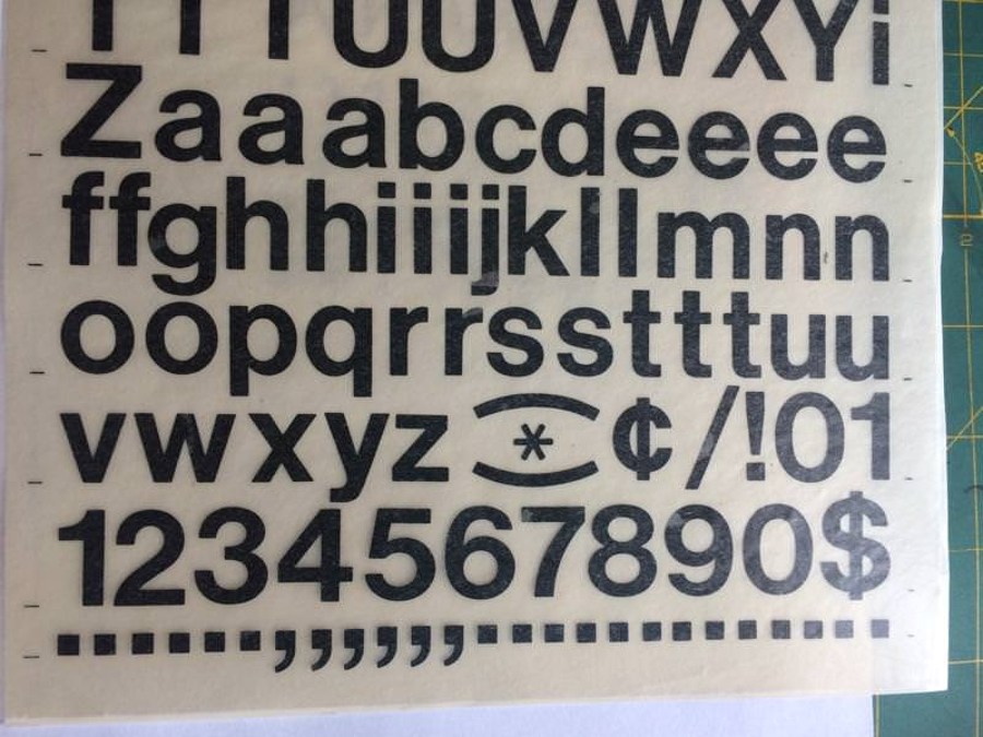
I’m going to offset this and use that black background of the text block to do a dropshadow. But first I need to add the journal number. Vintage Presstype to the rescue. This is a really cool thrift store find that I had been saving. Presstype lettering is a transfer lettering. Place where you want it and rub the front to transfer it.
Next step was to attach it. Since the rest of the cover has already been Mod Podged I didn’t need to worry about wrinkles this time around. I gave it an undercoat and two top coats.
I needed something to cover that last bit of text on the front cover. The title! I used a vintage DYMO tape labeler that I also found at the thrift shop. I love thrift shops.
In the end…
All done! Very happy with how this turned out. I had two large air bubbles in the collage on the front that I was able to push out before the Mod Podge set. This created a barely noticeable wrinkle just above the central figure and below the moon. Next time I’ll remember to use more clear acrylic spray. The Dymo tape did not stick to the Mod Podge at all. I had to stick it on a sheet of paper and cut it out then glue it down. The rear cover had two little bits of debris that got stuck in the Mod Podge and I didn’t notice until too late. Grrr. Just above the right figure’s head. Ah well….
The finishing touch is a strip of black Gorilla tape for the spine.
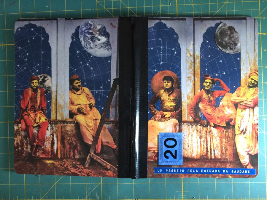
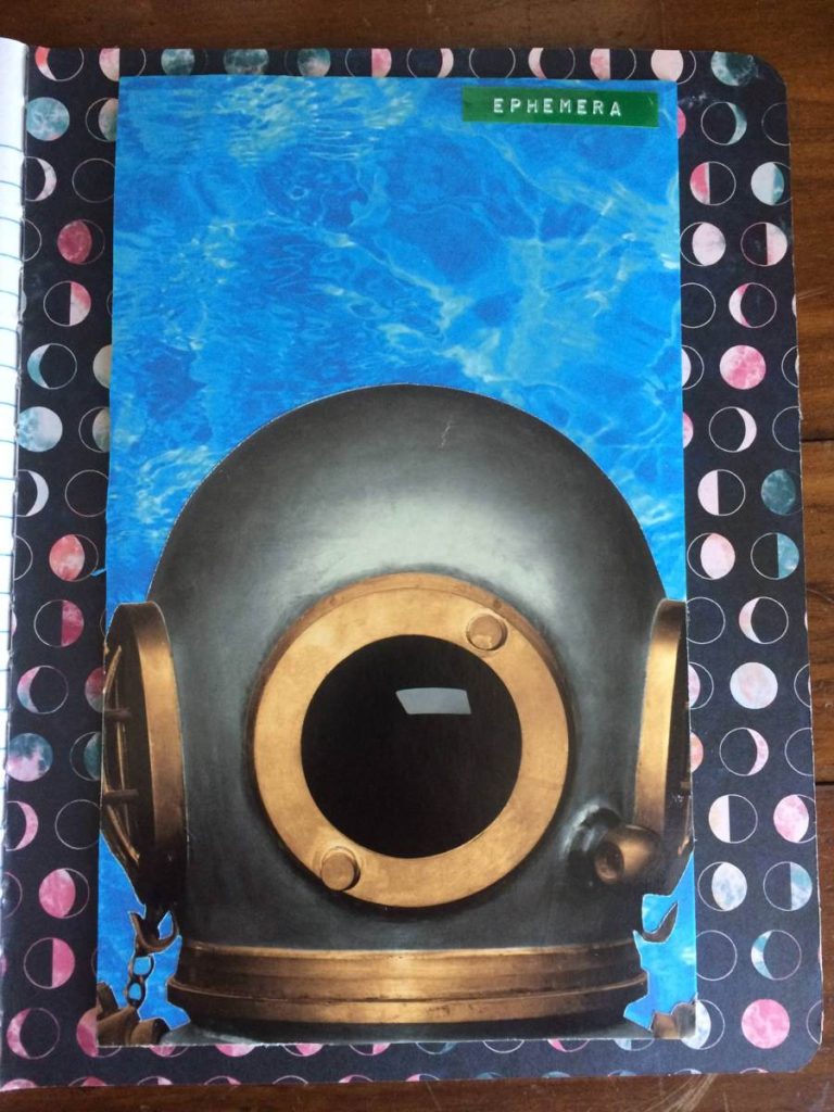
Some bonus pictures of this journal: Inside front cover and title page. I may add the title here but I haven’t decided yet. (*edit: I did not add the title) The rear inside cover has an ephemera pocket added.